Descriptive Statistics
Terms
- Ranking
- Arranging all the values in increasing order.
- Arithmetic mean
- The sum of all the values divided by how many there are.
- Deviation from the mean
- The difference between a value and the mean: \(x_i-\bar x\).
- Square root
- \(\sqrt{a}\) is the number that gives \(a\) when multiplied by itself.
- Standard deviation
- The number \(\sigma\) that shows how much the values typically differ from the mean.
- Typical range
- The interval from \(\bar x-\sigma\) to \(\bar x+\sigma\) around the mean.
- Median
- The value in the middle of a ranked data set. If there is an even number of values, it is the mean of the two middle values.
- Quartiles \(Q_1\) and \(Q_3\)
- The medians of the lower and upper halves of a ranked data set. When the number of values is odd, the median itself is included in both halves.
- Interquartile range
- The difference \(Q_3-Q_1\). It shows how spread out the middle part of the data is.
- Outlier
- A value that lies outside the boundaries found from the quartiles (formula below).
- Box plot
- A horizontal diagram: a box from \(Q_1\) to \(Q_3\) with a median line, and whiskers to the smallest and largest values. An outlier is marked with an X.
- Scatter plot
- Points \((x;\,y)\) that show the relationship between two variables. An association can be positive or negative, strong or weak.
- Trend line
- A line that describes the general tendency of the points and lets us make predictions.
Formulas
Task 1. Mean and Standard Deviation
The time a student spent on homework over 8 days (in minutes): 53, 46, 55, 61, 48, 54, 45, 54.
a) Find the mean. To make it easier, subtract 50 from each number.
b) Check yourself: find the deviation of each number from the mean and add them up. What
sum should you get?
c) Find the standard deviation.
| Day | 1 | 2 | 3 | 4 | 5 | 6 | 7 | 8 |
|---|---|---|---|---|---|---|---|---|
| Time | 53 | 46 | 55 | 61 | 48 | 54 | 45 | 54 |
| −50 | 3 | −4 | 5 | 11 | −2 | 4 | −5 | 4 |
| −52 | 1 | −6 | 3 | 9 | −4 | 2 | −7 | 2 |
| (−52)² | 1 | 36 | 9 | 81 | 16 | 4 | 49 | 4 |
a) The numbers in the second row add up to \(3-4+5+11-2+4-5+4=16\), and their mean is \(16/8=2\). Adding 50 back gives \(\bar x=52\) min.
b) The deviations from 52 are in the third row. They add up to \(1-6+3+9-4+2-7+2=0\), as they should. If the sum isn't zero, there's a mistake in the mean.
c) The squared deviations add up to \(1+36+9+81+16+4+49+4=200\). The mean of the squares is \(200/8=25\), so \(\sigma=\sqrt{25}=5\) min.
Task 2. Typical Range
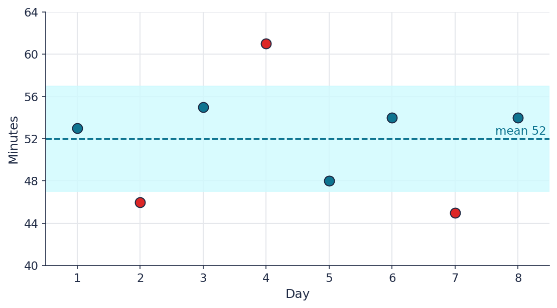
For the same data, draw a graph: day number along the horizontal axis, time in minutes along the vertical axis. Plot all 8 points and shade the band of the typical range \(\bar x\pm\sigma\). On which days did the time fall outside the range?
The typical range is from \(52-5=47\) to \(52+5=57\) minutes. Outside it are day 2 (46 min), day 4 (61 min), and day 7 (45 min).
Task 3. Median, Quartiles, and Outliers
The number of pages read in a day by 9 students: 22, 45, 14, 11, 19, 16, 24, 13, 15.
a) Find the median, \(Q_1\), \(Q_3\), and the interquartile range.
b) Find the boundaries beyond which values are considered outliers. Are there any
outliers?
c) Build a box plot for this data.
d) Without calculating the mean, say whether it will be greater or less than the median.
Explain.
a) Ranked: 11, 13, 14, 15, 16, 19, 22, 24, 45. The median is \(16\) (the fifth value). The lower half with the median: 11, 13, 14, 15, 16, so \(Q_1=14\). The upper half with the median: 16, 19, 22, 24, 45, so \(Q_3=22\). The interquartile range is \(Q_3-Q_1=22-14=8\).
b) The boundaries are \(14-1.5\cdot8=2\) and \(22+1.5\cdot8=34\). Values outside the interval \([2,\ 34]\) are outliers. The value 45 is greater than 34, so it's an outlier.
c) The box runs from 14 to 22 with the median at 16, the left whisker goes to 11, the right whisker goes to 45, and the value 45 is marked with an X.
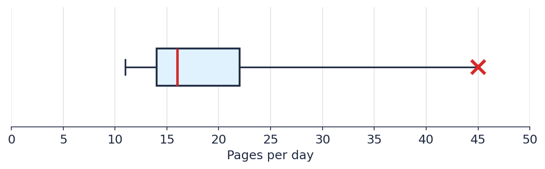
d) The mean will be greater than the median. One very large value (45) pulls the mean up, while the median barely reacts to it. As a check: the mean is \(179/9\approx19.9\).
Task 4. Scatter Plot and Trend Line
A taxi service recorded the cost of several rides:
| Distance, km | 2 | 4 | 5 | 7 | 8 | 10 |
|---|---|---|---|---|---|---|
| Cost, tenge | 620 | 780 | 920 | 1090 | 1230 | 1380 |
a) Plot the points on a graph. Describe the direction and strength of the association.
b) The trend line for this data is \(y=100x+400\), where \(x\) is the distance in km and
\(y\) is the cost in tenge. Draw it on the same graph.
c) What cost does the model predict for a 6 km ride?
d) How far can you ride if the cost of the ride is 1300 tenge?
e) What do the numbers 100 and 400 mean in this equation?
a) The association is positive (as the distance grows, so does the cost) and strong: the points lie tightly along one rising line.
b) Take two values of \(x\): at \(x=0\) we get \(y=400\), at \(x=10\) we get \(y=1400\). Draw a line through the points \((0;\,400)\) and \((10;\,1400)\).
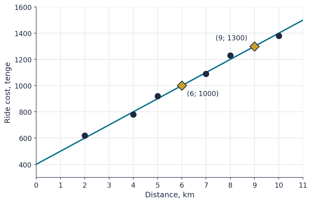
c) \(y=100\cdot6+400=1000\) tenge.
d) \(1300=100x+400\), so \(100x=900\) and \(x=9\) km.
e) The number 100 means that each additional kilometer increases the cost by 100 tenge. The number 400 is the cost of a ride at a distance of 0 km, that is, a fixed pickup fee.
Task 5. Comparing Two Classes
The diagram shows the time it took students in two classes to solve the same logic problem.

Write a conclusion for the teacher (4–6 sentences): in which class is the solving time usually shorter? In which does it vary more? What does the X on the diagram mean? Explain why, for class 9B, the median describes the typical time more honestly than the mean.
Sample answer. The median is the same in both classes, 10 minutes, so the typical solving time in the two classes is almost the same. However, in class 9B the time varies more: its box is wider (from 8 to 14 minutes, interquartile range 6) than that of 9A (from 8 to 12 minutes, interquartile range 4). The X in class 9B is an outlier: one student spent about 30 minutes on the problem, much longer than the others. For 9B the median is more honest, because one very large result raises the mean a lot, while the median barely changes and shows the time that is typical for most of the class.
What a good answer should include: a comparison of the centers (the medians are equal), a comparison of the spread (the width of the box), the outlier in 9B, an explanation of why the median resists an outlier, and numbers from the diagram in the text.
The Correlation Coefficient
Key Questions:
- How do we measure the strength of an association precisely, with a single number?
- How does the coefficient \(r\) relate to a scatter plot?
- Does correlation mean causation?
Goals and Learning Outcomes
Goals
- 1 Introduce the correlation coefficient \(r\) and teach how to calculate it from the formula.
- 2 Connect the numerical value of \(r\) to the shape of a scatter plot.
- 3 Show that correlation does not mean a cause-and-effect relationship.
Outcomes
- ✓ Student calculates the correlation coefficient from the formula for a small data set.
- ✓ Student matches a value of \(r\) to the shape of a scatter plot.
- ✓ Student explains why a strong correlation does not prove a cause-and-effect relationship.
From "By Eye" to a Number
Last lesson, we judged the strength of an association by eye — "tight" or "spread out." That works, but it's subjective: one person might call an association "strong" while another calls the very same plot "moderate."
How can we make that judgment precise and the same for everyone?
The Correlation Coefficient
The correlation coefficient \(r\) is a number from \(-1\) to \(1\) that precisely measures the direction and strength of the linear association between two variables:
The sign of \(r\) is the direction of the association (\(+\) positive, \(-\) negative).
The magnitude \(|r|\) is the strength: the closer to \(1\), the stronger; the closer to
\(0\), the weaker (or there's no association at all).
Formula and Calculation
\[ r = \frac{\sum (x_i-\bar x)(y_i-\bar y)}{\sqrt{\sum(x_i-\bar x)^2 \cdot \sum(y_i-\bar y)^2}} \]
Example. Data: \(x\): 1, 2, 3, 4, 5; \(y\): 2, 4, 5, 4, 5. Mean \(\bar x=3\), \(\bar y=4\).
| \(x\) | 1 | 2 | 3 | 4 | 5 |
|---|---|---|---|---|---|
| \(y\) | 2 | 4 | 5 | 4 | 5 |
| \(x-\bar x\) | -2 | -1 | 0 | 1 | 2 |
| \(y-\bar y\) | -2 | 0 | 1 | 0 | 1 |
| \((x-\bar x)(y-\bar y)\) | 4 | 0 | 0 | 0 | 2 |
| \((x-\bar x)^2\) | 4 | 1 | 0 | 1 | 4 |
| \((y-\bar y)^2\) | 4 | 0 | 1 | 0 | 1 |
Sums: \(\sum(x-\bar x)(y-\bar y)=6\), \(\sum(x-\bar x)^2=10\), \(\sum(y-\bar y)^2=6\).
\[ r = \frac{6}{\sqrt{10\cdot 6}} = \frac{6}{\sqrt{60}} \approx 0.77 \]
Matching \(r\) to the Diagrams
Recall the five scatter plots from last lesson. What do you think the approximate value of \(r\) is for each one?
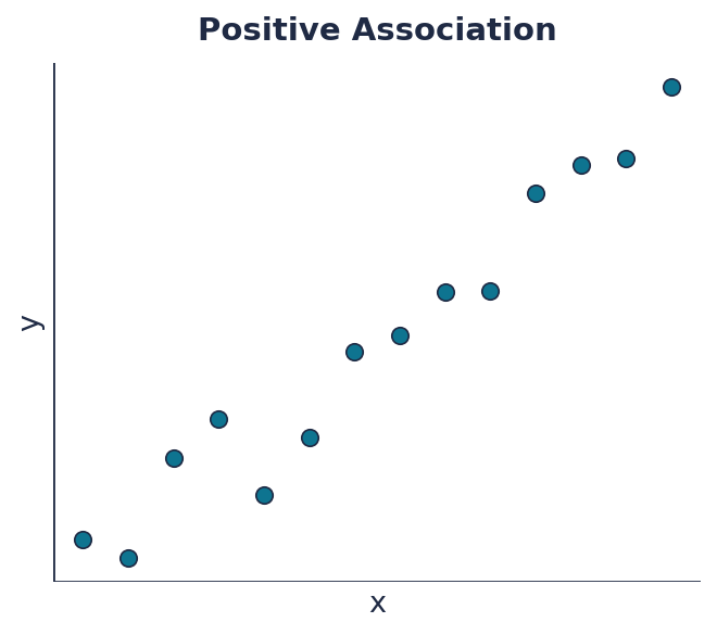
r ≈ 0.97
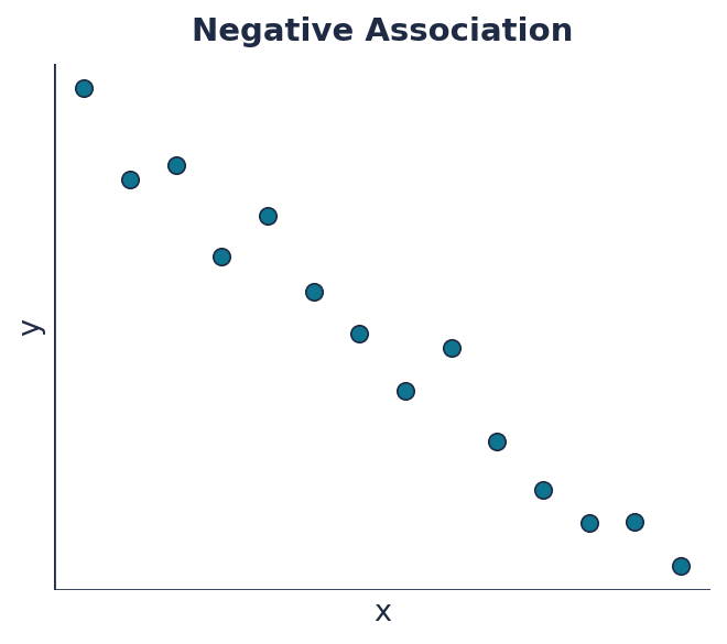
r ≈ -0.98
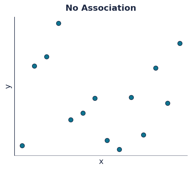
r ≈ 0.00
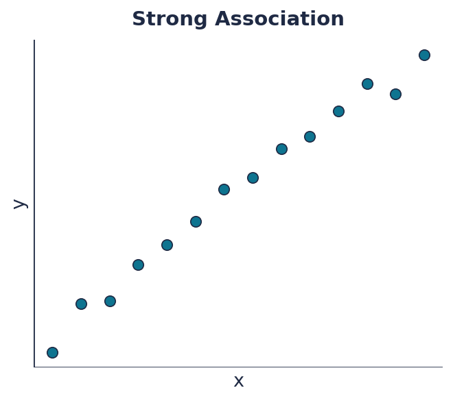
r ≈ 0.99
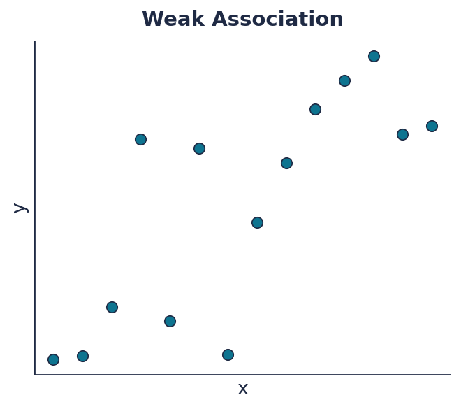
r ≈ 0.77
An interesting observation: the "weak association" diagram gives \(r\approx0.77\) — exactly the same number we just got in the worked example above! Even when points look fairly spread out by eye, the numerical association can still be quite noticeable.
Firefighters and Fire Damage
In city statistics, the number of firefighters sent to a fire and the amount of damage the fire causes are strongly positively correlated: the more firefighters show up, the greater the damage. Does that mean firefighters somehow cause more damage — and cities should send fewer of them?
No. Both quantities share a hidden common cause — the size and severity of the fire itself. Bigger fires get more firefighters sent to them, and bigger fires also cause more damage. The association between the number of firefighters and the damage is the result of a third variable (the scale of the fire) affecting both at once. Such a hidden variable is called a confounding variable.
How Does an Outlier Affect \(r\)?
If you add one outlier point — one that doesn't fit the general trend at all — to data with a strong positive association, how does \(|r|\) change: does it increase or decrease? Why?
An outlier "pulls" points away from the overall line, making the association look less consistent — so \(|r|\) usually decreases when an outlier that doesn't fit the trend appears.
PROBLEMS
- Calculate the correlation coefficient for the data: \(x\): 1, 2, 3, 4; \(y\): 3, 5, 6, 10.
- A scatter plot has a correlation coefficient of \(r=-0.92\). Describe the direction and strength of the association.
- Hours of machine operation and number of parts produced: \(x\): 2, 4, 6, 8; \(y\): 5, 9, 12, 20. Calculate the correlation coefficient.
- If you remove one point from a data set with \(r=0.65\) that was a clear outlier, far from the general trend, how will \(r\) change? Explain.
- \(\bar x=2.5\), \(\bar y=6\). \(\sum(x-\bar x)(y-\bar y)=11\), \(\sum(x-\bar x)^2=5\), \(\sum(y-\bar y)^2=26\). \(r=\dfrac{11}{\sqrt{5\cdot26}}=\dfrac{11}{\sqrt{130}}\approx0.97\).
- The association is negative and very strong — the points lie very close to a downward line.
- \(\bar x=5\), \(\bar y=11.5\). \(\sum(x-\bar x)(y-\bar y)=48\), \(\sum(x-\bar x)^2=20\), \(\sum(y-\bar y)^2=121\). \(r=\dfrac{48}{\sqrt{20\cdot121}}=\dfrac{48}{\sqrt{2420}}\approx0.98\).
- \(|r|\) will increase (get closer to 1) — without the outlier pulling points away, the remaining data will look more consistently associated.
Exit Ticket
A scatter plot has a correlation coefficient of \(r=0.15\). Describe the strength and direction of the association. Can this value of \(r\) tell us there's a cause-and-effect relationship between the variables?
Homework
Solve the following four problems the same way we did in class.
- Calculate the correlation coefficient for the data: \(x\): 1, 2, 3, 4, 5; \(y\): 10, 8, 7, 5, 4.
- The correlation coefficient between hours spent playing video games and test score is \(r=-0.4\). Describe the direction and strength of the association. Does this mean video games lower test scores?
- Number of ad impressions and number of sales: \(x\): 1, 2, 3, 4; \(y\): 20, 25, 23, 30. Calculate the correlation coefficient.
- A scatter plot has a correlation coefficient of \(r=0.88\). If you remove one point that was a clear outlier, far from the general trend, how will \(r\) change?
- \(\bar x=3\), \(\bar y=6.8\). \(\sum(x-\bar x)(y-\bar y)=-15\), \(\sum(x-\bar x)^2=10\), \(\sum(y-\bar y)^2=22.8\). \(r=\dfrac{-15}{\sqrt{10\cdot22.8}}=\dfrac{-15}{\sqrt{228}}\approx-0.99\).
- The association is negative and moderate (not very strong). The value of \(r\) alone doesn't prove a cause-and-effect relationship — there could be a hidden variable (for example, more disciplined students might both play fewer games and study more, which doesn't necessarily mean games themselves hurt grades).
- \(\bar x=2.5\), \(\bar y=24.5\). \(\sum(x-\bar x)(y-\bar y)=14\), \(\sum(x-\bar x)^2=5\), \(\sum(y-\bar y)^2=53\). \(r=\dfrac{14}{\sqrt{5\cdot53}}=\dfrac{14}{\sqrt{265}}\approx0.86\).
- \(|r|\) will increase (get closer to 1) — without the outlier, the remaining points will look more consistently associated.
Scatter Plots
Key Questions:
- How do we picture the relationship between two variables?
- How do we judge the direction and strength of an association by eye?
- How do we use a trend line to make predictions?
Goals and Learning Outcomes
Goals
- 1 Introduce the scatter plot and the direction of an association.
- 2 Teach how to judge the strength of an association qualitatively from the shape of the plot.
- 3 Teach how to build a trend line and use it to make predictions.
Outcomes
- ✓ Student determines the direction and strength of an association from a scatter plot.
- ✓ Student plots a trend line from a given equation.
- ✓ Student uses a trend line's equation for forward and backward predictions and explains what its coefficients mean.
Is There a Relationship?
Hours spent studying for an exam and the test score for eight students:
| Hours studying | 1 | 2 | 3 | 4 | 5 | 6 | 7 | 8 |
|---|---|---|---|---|---|---|---|---|
| Test score | 55 | 58 | 62 | 68 | 70 | 75 | 80 | 85 |
Plot all 8 points on a graph (hours along the horizontal axis, score along the vertical axis). Is there a relationship between these two variables? How would you describe it?
Scatter Plot
A scatter plot shows the relationship between two variables: each observation becomes one point with coordinates \((x, y)\).
Direction of an Association
If the points generally rise from left to right — the association is positive (as \(x\) grows, so does \(y\)). If the points fall — the association is negative. If no pattern is visible — there's no association.
Strength of an Association
If the points sit tightly, close to one imaginary line — the association is strong. If the points are spread widely around the general direction — the association is weak. Both examples below are positive associations, just of different strength.
Building a Trend Line
A car's fuel consumption as a function of its speed (liters per 100 km):
| Speed, km/h | 40 | 60 | 80 | 100 | 120 |
|---|---|---|---|---|---|
| Consumption, L/100km | 11 | 9 | 8 | 6 | 3 |
The trend line for this data: \(y = -0.1x + 15\) (given as a fact).
Plot all the data points on a graph and draw the trend line \(y=-0.1x+15\) (pick any two values of \(x\), find \(y\), and draw a line through them).
Predictions from the Trend Line
We'll use the same equation: \(y = -0.1x + 15\), where \(x\) is speed (km/h) and \(y\) is fuel consumption (L/100km).
a) Forward prediction. What fuel consumption does the model predict at a speed of \(x=70\) km/h?
b) Backward prediction. At what speed does the model predict a consumption of \(y=4\) L/100km?
c) Interpretation. What does the number \(-0.1\) mean in this equation? What does the number \(15\) mean?
PROBLEMS
- The points (1, 10), (2, 12), (3, 9), (4, 15), (5, 14), (6, 18) are given. Determine the direction of the association and describe its strength (tight/spread out).
- A trend line passes through the points \((2, 10)\) and \((6, 26)\). Find its equation and predict \(y\) at \(x=10\).
- The price of a used car (in millions of tenge) as a function of its mileage (in
thousands of km) is given by \(y = -0.05x + 20\).
a) What price does the model predict at a mileage of 100 thousand km?
b) At what mileage does the model predict a price of 12 million tenge?
c) What do the numbers \(-0.05\) and \(20\) mean in this equation? - Hours of training per week and push-ups per set: (1, 8), (2, 10), (3, 9), (4, 14), (5, 13), (6, 17). Determine the direction of the association and describe its strength.
- The association is positive (as \(x\) grows, so does \(y\)), fairly strong — the points aren't perfect, but stay close to a general upward line.
- \(k=\dfrac{26-10}{6-2}=4\); \(b=10-4\cdot2=2\); \(y=4x+2\). At \(x=10\): \(y=42\).
- a) \(y=-0.05\cdot100+20=15\) million tenge.
b) \(12=-0.05x+20 \Rightarrow -0.05x=-8 \Rightarrow x=160\) thousand km.
c) \(-0.05\) — each additional thousand km of mileage lowers the price by 0.05 million tenge (50 thousand); \(20\) — the model's predicted price for a brand-new car (zero mileage). - The association is positive, fairly strong — the points stay close to a general upward line.
Exit Ticket
A trend line passes through the points \((1, 5)\) and \((4, 17)\). Find its equation and predict \(y\) at \(x=8\).
Homework
Solve the following four problems the same way we did in class.
- A trend line passes through the points \((3, 8)\) and \((9, 26)\). Find its equation, predict \(y\) at \(x=12\), and find \(x\) when \(y=2\).
- Ice cream sales (in hundreds of servings) as a function of air temperature (°C) are
given by \(y = 0.8x - 4\).
a) How many servings does the model predict at a temperature of \(30°\)C?
b) At what temperature does the model predict sales of 12 hundred servings?
c) What do the numbers \(0.8\) and \(-4\) mean in this equation? Is the model's prediction at \(0°\)C reasonable? - The points (1, 20), (2, 15), (3, 17), (4, 10), (5, 8), (6, 5) are given. Determine the direction of the association and describe its strength.
- Hours of sleep and number of mistakes on the next day's test: (4, 10), (5, 8), (6, 5), (7, 4), (8, 3), (9, 2). Determine the direction of the association and describe its strength.
- \(k=\dfrac{26-8}{9-3}=3\); \(b=8-3\cdot3=-1\); \(y=3x-1\). At \(x=12\): \(y=35\). At \(y=2\): \(2=3x-1 \Rightarrow x=1\).
- a) \(y=0.8\cdot30-4=20\) (hundred servings).
b) \(12=0.8x-4 \Rightarrow 0.8x=16 \Rightarrow x=20°\)C.
c) \(0.8\) — each degree increases sales by 0.8 hundred (80 servings); \(-4\) — the model's prediction at \(0°\)C. That prediction isn't reasonable (a negative number of servings makes no sense) — the model only works within the range of the actual observations. - The association is negative (as \(x\) grows, \(y\) decreases), fairly strong — most points stay close to a general downward line.
- The association is negative, strong — the points stay very close to a general downward line.
The Box Plot
Key Questions:
- What parts make up a box plot?
- What does the shape of a diagram tell us about skewness?
- How do we compare several box plots to each other?
Goals and Learning Outcomes
Goals
- 1 Learn the anatomy of a box plot.
- 2 Introduce the idea of skewness and show how to read it from the shape of the diagram.
- 3 Teach how to build and compare several box plots, and how to compare two ways of defining a typical range.
Outcomes
- ✓ Student reads \(Q_1\), the median, \(Q_3\), the whiskers, and outliers from a given diagram.
- ✓ Student determines the direction of skew from the shape of a box plot.
- ✓ Student builds a box plot from raw data and compares two ways of defining a typical range.
The Anatomy of a Box Plot
A box plot shows several characteristics of a data set at once, and is drawn horizontally:
The box runs from \(Q_1\) to \(Q_3\), with the median line inside.
The whiskers run from the box to the smallest and the largest value in the data.
Outliers — values that fall outside the typical range
\([\,Q_1-1.5\,IQR,\ \ Q_3+1.5\,IQR\,]\) — are marked with an X.
Skewness
The shape of a box plot shows which way the data is "stretched."
If the median is closer to \(Q_1\) and the right whisker is longer — the data is
skewed right (a small group of high values is stretching the diagram to the right).
If the median is closer to \(Q_3\) and the left whisker is longer — the data is
skewed left.
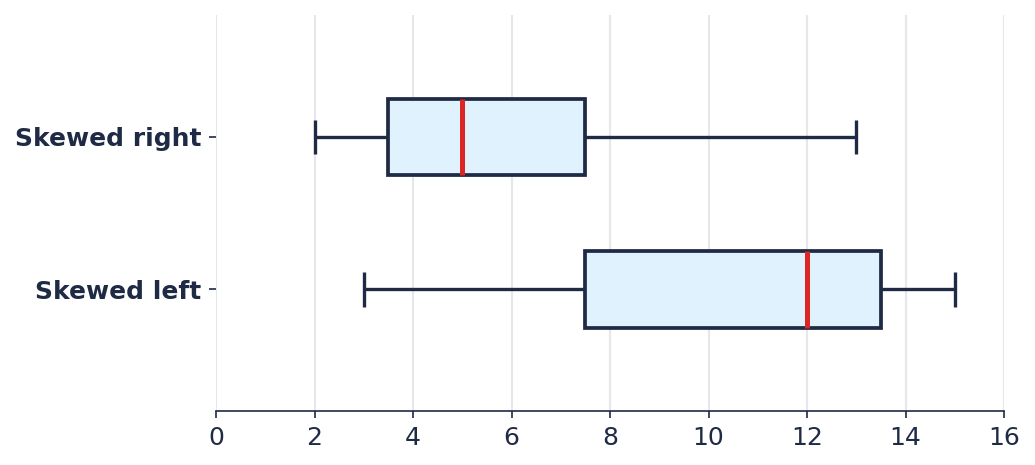
Example. Set A: 2, 3, 4, 5, 6, 9, 13. Ranked, \(n=7\): median \(=5\), \(Q_1=3.5\), \(Q_3=7.5\). The median is closer to \(Q_1\) (\(5-3.5=1.5\)) than to \(Q_3\) (\(7.5-5=2.5\)), and the right whisker (to 13) is much longer than the left one (to 2) — skewed right.
Set B: 3, 4, 11, 12, 13, 14, 15. Median \(=12\), \(Q_1=7.5\), \(Q_3=13.5\). The median is closer to \(Q_3\) (\(13.5-12=1.5\)) than to \(Q_1\) (\(12-7.5=4.5\)), and the left whisker (to 3) is much longer than the right one (to 15) — skewed left.
Comparing Box Plots by City
5-6 minIn your groups, put everyone's box plot (from your city weather data from last lesson) on a single scale — for example, on one sheet of paper or in one person's notebook.
- Whose city has the highest typical temperature (by median)?
- Whose data has the biggest spread (the widest box)?
- Does anyone show clear skew or an outlier? What might that mean for that city's weather?
Box Plot or Typical Range?
In Lesson 3, we built a typical range \(\bar x \pm \sigma\) around the mean. A box plot uses a different center (the median) and a different measure of spread (\(Q_1\), \(Q_3\), IQR).
If the data has a strong outlier, the mean and \(\sigma\) shift along with it, while the median and quartiles barely move. So when an outlier is suspected, a range based on IQR usually gives a more honest picture of what's "typical" than the \(\bar x \pm \sigma\) range.
PROBLEMS
-
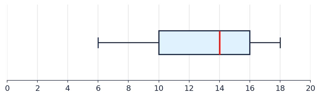 From the diagram, find \(Q_1\), the median, \(Q_3\), and the direction of skew.
-
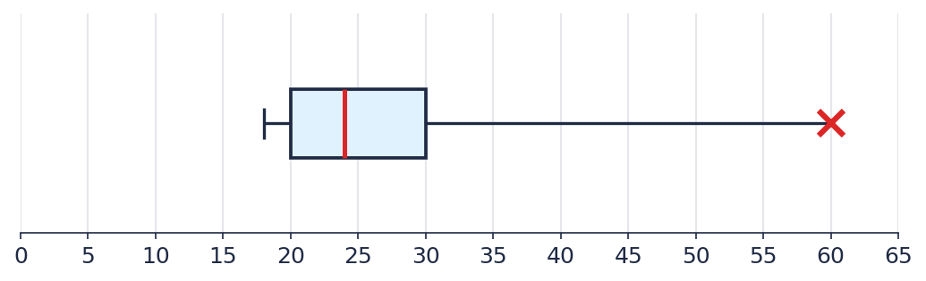 From the diagram, find \(Q_1\), the median, \(Q_3\), the direction of skew, and whether
there's an outlier.
From the diagram, find \(Q_1\), the median, \(Q_3\), the direction of skew, and whether
there's an outlier.
- Two sets of numbers are given.
Set 1: 5, 7, 9, 11, 13, 15, 17.
Set 2: 20, 22, 24, 26, 28, 30, 55.
For each set, find the median, \(Q_1\), \(Q_3\), and the typical range \([\,Q_1-1.5\,IQR,\ Q_3+1.5\,IQR\,]\). Plot a box plot for both sets on the same scale and compare them: which set has more spread? Is there an outlier? - The set of numbers 44, 46, 48, 50, 52, 54, 56 is given.
a) Find the mean and standard deviation, and build the typical range \(\bar x \pm \sigma\).
b) Find the median, \(Q_1\), \(Q_3\), and build the typical range using IQR.
c) Compare the width of both ranges — which one is wider?
-
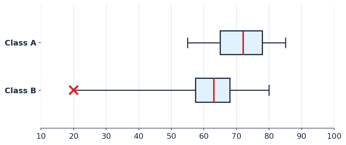 Compare the exam results of Class A and Class B: which class has the higher typical
score? Which has more spread? Is there an outlier?
Compare the exam results of Class A and Class B: which class has the higher typical
score? Which has more spread? Is there an outlier?
-
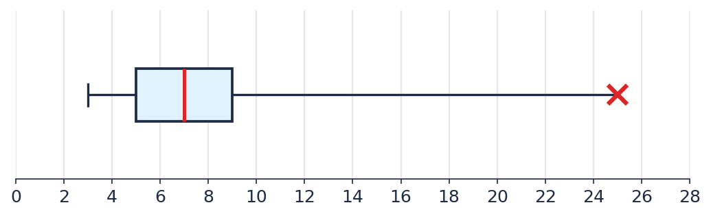 The diagram shows taxi wait times (in minutes). Describe the typical waiting range and
explain what the marked point means.
The diagram shows taxi wait times (in minutes). Describe the typical waiting range and
explain what the marked point means.
- Seedling height (in cm) under two types of fertilizer.
Group X: 10, 12, 13, 14, 15, 17, 19.
Group Y: 8, 9, 10, 11, 12, 13, 30.
For each group, find the median, \(Q_1\), \(Q_3\), and the typical range. Plot a box plot for both groups on the same scale and determine which fertilizer gives more consistent results. - Salaries of employees at a small company (in thousands of tenge): 200, 210, 215, 220,
230, 240, 900.
a) Find the mean, standard deviation, and the typical range \(\bar x \pm \sigma\).
b) Find the median, \(Q_1\), \(Q_3\), and the typical range using IQR.
c) Which of the two ranges better describes a typical salary at the company? Why?
- \(Q_1=10\), median \(=14\), \(Q_3=16\). The median is closer to \(Q_3\), and the left whisker is longer — skewed left.
- \(Q_1=20\), median \(=24\), \(Q_3=30\). The median is closer to \(Q_1\), and the right whisker is longer — skewed right. The point at 60 is an outlier.
- Set 1: median \(=11\), \(Q_1=8\), \(Q_3=14\), \(IQR=6\), typical range
\([-1,\ 23]\) — no outliers; every value fits inside the box and whiskers with no X
marks.
Set 2: median \(=26\), \(Q_1=23\), \(Q_3=29\), \(IQR=6\), typical range \([14,\ 38]\) — the value 55 falls outside it, so it's an outlier (marked with an X at the right end of the whisker). Set 2's core spread looks similar to Set 1's, but it has a clear outlier. - a) mean \(=50\), standard deviation \(=4\), typical range \([46,\ 54]\).
b) median \(=50\), \(Q_1=47\), \(Q_3=53\), \(IQR=6\), typical range via IQR — \([38,\ 62]\).
c) the IQR-based range (\([38,62]\), width 24) is noticeably wider than the \(\bar x\pm\sigma\) range (\([46,54]\), width 8) — these are two different ways of defining "typical," and they don't match even without any outliers.
- Class A's median (72) is higher than Class B's (63), and Class B has more spread. Class B has an outlier — a student who scored 20 (marked with an X).
- The typical wait time (between \(Q_1\) and \(Q_3\)) is 5 to 9 minutes. The point at 25 is an outlier: one time the taxi took much longer than usual.
- Group X: median \(=14\), \(Q_1=12.5\), \(Q_3=16\), \(IQR=3.5\), typical range
\([7.25,\ 21.25]\) — no outliers.
Group Y: median \(=11\), \(Q_1=9.5\), \(Q_3=12.5\), \(IQR=3\), typical range \([5,\ 17]\) — the value 30 is an outlier.
Group X gives the more consistent result: it has no outlier, and its core spread isn't distorted by one atypical seedling. - a) mean \(\approx 316.4\) (thousand tenge), standard deviation \(\approx 238.5\),
typical range \(\bar x\pm\sigma \approx [77.9,\ 554.9]\).
b) median \(=220\), \(Q_1=212.5\), \(Q_3=235\), \(IQR=22.5\), typical range via IQR — \([178.75,\ 268.75]\).
c) the IQR-based range describes a typical salary far better (most employees earn 200-240 thousand) — the \(\bar x\pm\sigma\) range is badly stretched and shifted by the single 900-thousand salary.
Exit Ticket
If a box plot's median sits closer to the top of the box (\(Q_3\)), and the left whisker is noticeably longer than the right one — which way is the distribution skewed? Explain how you determined this.
Homework
Solve the following four problems the same way we did in class.
- Two sets of numbers are given.
Set 1: 3, 5, 7, 9, 11, 13, 15.
Set 2: 10, 12, 14, 16, 18, 20, 45.
For each set, find the median, \(Q_1\), \(Q_3\), and the typical range. Plot a box plot for both sets on the same scale and compare them. - Test scores (in points) in two groups.
Group P: 60, 62, 64, 66, 68, 70, 72.
Group Q: 55, 58, 60, 62, 64, 66, 95.
For each group, find the median, \(Q_1\), \(Q_3\), and the typical range. Plot a box plot for both groups on the same scale and determine which group's results are more consistent. - The set of numbers 64, 66, 68, 70, 72, 74, 76 is given.
a) Find the mean, standard deviation, and the typical range \(\bar x \pm \sigma\).
b) Find the median, \(Q_1\), \(Q_3\), and the typical range using IQR.
c) Compare the width of both ranges. - Time to solve a problem by students (in seconds): 40, 42, 44, 46, 48, 50, 150.
a) Find the mean, standard deviation, and the typical range \(\bar x \pm \sigma\).
b) Find the median, \(Q_1\), \(Q_3\), and the typical range using IQR.
c) Which of the two ranges better describes the typical time to solve the problem? Why?
- Set 1: median \(=9\), \(Q_1=6\), \(Q_3=12\), \(IQR=6\), typical range
\([-3,\ 21]\) — no outliers.
Set 2: median \(=16\), \(Q_1=13\), \(Q_3=19\), \(IQR=6\), typical range \([4,\ 28]\) — the value 45 is an outlier. - Group P: median \(=66\), \(Q_1=63\), \(Q_3=69\), \(IQR=6\), typical range
\([54,\ 78]\) — no outliers.
Group Q: median \(=62\), \(Q_1=59\), \(Q_3=65\), \(IQR=6\), typical range \([50,\ 74]\) — the value 95 is an outlier. Group P's results are more consistent. - a) mean \(=70\), standard deviation \(=4\), typical range \([66,\ 74]\).
b) median \(=70\), \(Q_1=67\), \(Q_3=73\), \(IQR=6\), typical range via IQR — \([58,\ 82]\).
c) the IQR-based range (width 24) is again noticeably wider than the \(\bar x\pm\sigma\) range (width 8). - a) mean \(=60\), standard deviation \(\approx 36.9\), typical range
\(\bar x\pm\sigma \approx [23.1,\ 96.9]\).
b) median \(=46\), \(Q_1=43\), \(Q_3=49\), \(IQR=6\), typical range via IQR — \([34,\ 58]\).
c) the IQR-based range describes the typical time far better (most students finished in 40-50 seconds) — the \(\bar x\pm\sigma\) range is stretched by one student who took much longer than everyone else.
Atypical Data
Key Questions:
- What is the median, and how does it differ from the mean?
- How do we find the quartiles of a data set?
- How do we tell whether a value is an outlier?
Goals and Learning Outcomes
Goals
- 1 Introduce the definitions of the median and quartiles.
- 2 Show the rule for identifying an outlier using the interquartile range (IQR).
- 3 Demonstrate that the median is more resistant to outliers than the mean.
Outcomes
- ✓ Student finds the median and quartiles of a data set.
- ✓ Student calculates the interquartile range and determines whether an outlier is present.
- ✓ Student explains why the median is more resistant to outliers than the mean.
Refining the Forecast
You already have data on your commute speed to school from the first week of the project. Look at the data you've collected and refine your hypothesis about the class's average speed — how has it changed compared to your very first, off-the-cuff prediction?
Medians and Quartiles
Ranking a data set means arranging all the values in increasing order. Many statistics (the median, the quartiles) are calculated from ranked data.
The median is the value sitting exactly in the middle of a ranked data set: half the values are below it, half are above it. If the number of values \(n\) is odd, the median is the single middle value. If \(n\) is even, the median is the arithmetic mean of the two middle values.
Quartiles split a ranked data set into four roughly equal parts: \(Q_1\) (the first quartile) is the median of the lower half of the data; \(Q_2\) is simply the median of the whole set; \(Q_3\) (the third quartile) is the median of the upper half of the data.
Note: in this unit, we always include the median itself in both halves when finding \(Q_1\) and \(Q_3\) (when \(n\) is odd).
Weather in Your City
Pick any city — your hometown, a city where relatives live, or just one you find interesting. Find the average daily temperature for each of the last 14 days (for example, on a weather archive website).
Rank your 14 values and find the median, \(Q_1\), and \(Q_3\).
Interquartile Range and Outliers
The interquartile range shows how spread out the middle part of the data is:
\[ IQR = Q_3 - Q_1 \]
A value is considered an outlier if it lies outside the boundaries:
\[ [\,Q_1 - 1.5\cdot IQR,\ \ Q_3 + 1.5\cdot IQR\,] \]
Calculate the \(IQR\) for your own weather data from the previous task and determine whether it contains an outlier.
The Median Is Resistant to Outliers
Take the air temperature by day of the week (°C): Mon 21, Tue 50, Wed 17, Thu 25, Fri 19, Sat 23, Sun 27.
Rank them: 17, 19, 21, 23, 25, 27, 50. The median (the middle value) \(=23\). The lower half (including the median) — 17, 19, 21, 23 → \(Q_1=\dfrac{19+21}{2}=20\). The upper half (including the median) — 23, 25, 27, 50 → \(Q_3=\dfrac{25+27}{2}=26\). The interquartile range \(IQR=26-20=6\). The upper fence \(=26+1.5\cdot6=35\): since \(50>35\), that's an outlier.
Let's remove the outlier and compare what happens to the mean and to the median:
With all the data: mean \(=182/7\approx26\), median \(=23\).
Without the outlier (17, 19, 21, 23, 25, 27): mean \(=132/6=22\), median \(=(21+23)/2=22\).
The mean shifted by 4 degrees, while the median shifted by only 1. A single atypical day strongly shifts the mean, but barely affects the median.
PROBLEMS
- Find the median and quartiles of the set of numbers: 4, 9, 2, 11, 7. Are there any outliers?
- Find the median and quartiles of the set of numbers: 2, 3, 5, 7, 8, 9, 11, 50. Are there any outliers?
- Movie ticket prices at different cinemas in the city (in local currency): 1200, 1500, 1300, 1400, 1600, 1100, 4500. Find the median, the quartiles, and determine whether there's an outlier.
- Time spent on homework by classmates (in minutes): 30, 45, 35, 40, 50, 42, 38, 100. Find the median, the quartiles, and determine whether there's an outlier.
- Ranked: 2, 4, 7, 9, 11. Median = 7, \(Q_1=4\), \(Q_3=9\), \(IQR=5\); fences \([-3.5,\ 16.5]\) — no outliers.
- Median = 8, \(Q_1=4\), \(Q_3=10\), \(IQR=6\); upper fence \(10+9=19\) — 50 is an outlier.
- Ranked: 1100, 1200, 1300, 1400, 1500, 1600, 4500. Median = 1400, \(Q_1=1250\), \(Q_3=1550\), \(IQR=300\); upper fence \(1550+450=2000\) — 4500 is an outlier.
- Ranked: 30, 35, 38, 40, 42, 45, 50, 100. Median = 41, \(Q_1=36.5\), \(Q_3=47.5\), \(IQR=11\); upper fence \(47.5+16.5=64\) — 100 is an outlier.
Exit Ticket
Find the median, \(Q_1\), and \(Q_3\) of the set of numbers: 6, 10, 4, 14, 8, 12, 20. Are there any outliers here?
Homework
Solve the following two problems the same way we did in class.
- Number of books read this semester by classmates: 3, 5, 4, 6, 7, 5, 8. Find the median, the quartiles, and determine whether there's an outlier.
- Salaries of employees at a small company (in thousands of tenge): 200, 220, 210, 230, 240, 215, 900. Find the median, the quartiles, and determine whether there's an outlier.
- Ranked: 3, 4, 5, 5, 6, 7, 8. Median = 5, \(Q_1=4.5\), \(Q_3=6.5\), \(IQR=2\); fences \([1.5,\ 9.5]\) — no outliers.
- Ranked: 200, 210, 215, 220, 230, 240, 900. Median = 220, \(Q_1=212.5\), \(Q_3=235\), \(IQR=22.5\); upper fence \(235+33.75=268.75\) — 900 is an outlier.
Typical Range
Key Questions:
- How do we show a "typical range" of values on a graph?
- How do we plot a line from its equation?
- What changes if the data is rising or falling over time?
Goals and Learning Outcomes
Goals
- 1 Introduce the idea of a typical range and an explicit convention for its width.
- 2 Teach how to plot a line from its equation.
- 3 Show what a typical range looks like around a rising/falling trend, not just around a constant mean.
Outcomes
- ✓ Student draws a typical range around a mean on a graph.
- ✓ Student plots a line from an equation of the form \(y=kx+b\).
- ✓ Student draws a range band around a sloped trend line.
Recalling the Last Lesson
Last lesson, for a week of HRV data (55, 59, 67, 65, 61, 57, 63), we calculated: mean \(\bar x = 61\) ms, standard deviation \(\sigma = 4\) ms.
How could we show these two numbers on a graph so it's immediately clear which days were "typical" and which weren't?
Typical Range
A typical range is an interval around the mean where the values in a data set usually fall:
\[ [\bar x - \sigma,\ \bar x + \sigma] \]
The width of such a range is a convention, and it can vary between sources (for example, some use \(\pm 2\sigma\), or a range based on percentiles). In this unit, we always use a width of \(\pm 1\sigma\) — that is, from \(\bar x - \sigma\) to \(\bar x + \sigma\) — so our drawings match the examples.
Building the Typical Range for HRV
On paper, draw a graph: days of the week (Fri-Thu) along the horizontal axis, HRV values along the vertical axis. Plot all 7 values as points, then shade the typical-range band from \(61-4=57\) to \(61+4=65\).
Which days fall inside the typical range, and which don't?
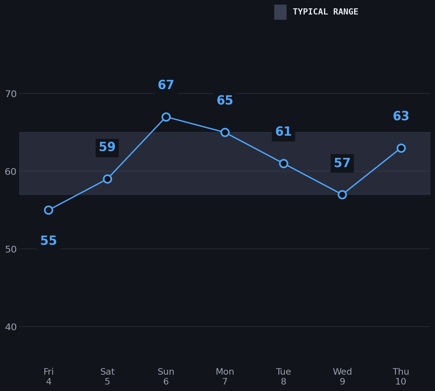
This is how real fitness watches show the same idea — the "typical range" band is exactly \(\bar x \pm \sigma\).
Equation of a Line
A line on a graph can be given by an equation of the form \(y = kx + b\), where \(k\) and \(b\) are numbers.
To plot a line from such an equation:
- Pick any two values of \(x\) (for example, the smallest and largest ones in your data).
- Calculate the corresponding \(y\) by substituting each \(x\) into the equation.
- Plot both points on the graph and draw a straight line through them.
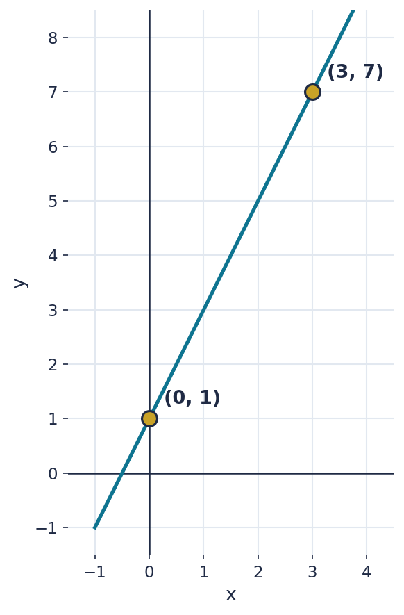
Example. Let's plot the line \(y = 2x + 1\).
Take \(x=0\): \(y = 2\cdot 0 + 1 = 1\) — point \((0, 1)\).
Take \(x=3\): \(y = 2\cdot 3 + 1 = 7\) — point \((3, 7)\).
We plot both points and draw a line through them:
A Typical Range Around a Trend Line
If the data doesn't hover around a constant mean but rises or falls over time, the typical range should "tilt" along with the trend too, instead of staying a horizontal band.
The data — pages left to read in a book, by day:
| Day | 1 | 2 | 3 | 4 | 5 | 6 |
|---|---|---|---|---|---|---|
| Pages left | 8 | 7 | 6 | 6 | 4 | 3 |
The trend line for this data: \(y = -x + 9\). The width of the typical range is \(\pm 1\) around this line.
On a single graph: a) plot all the data points; b) draw the line \(y=-x+9\); c) shade a band of width \(\pm 1\) around this line along its entire length.
PROBLEMS
- The line \(y = -2x + 5\) is given. Find \(y\) at \(x=0\) and at \(x=3\), then plot this line on a graph.
- Find the equation of the line through the points \((1, 3)\) and \((4, 12)\).
- Over 5 days, the number of active calories (in hundreds) was: 6, 11, 11, 11, 11. Find the mean, the standard deviation, and the boundaries of the typical range.
- New blog subscribers by day of the week: Mon — 5, Tue — 7, Wed — 8, Thu — 10, Fri — 11, Sat — 13, Sun — 14. Trend line: \(y = 1.5x + 4\) (where \(x\) is the day number, starting at 1 for Monday). Typical-range width: \(\pm 1\). Plot the points, the trend line, and the range band on a graph.
- \(y(0) = 5\); \(y(3) = -1\).
- \(k = \dfrac{12-3}{4-1} = 3\); \(b = 3 - 3\cdot 1 = 0\); \(y = 3x\).
- Mean = 10 (hundreds of calories), standard deviation = 2, typical range — from 8 to 12 (hundreds of calories).
- The points, trend line, and range band should run diagonally from bottom-left to top-right (a rising trend). Check: all 7 points should fall inside a band of width \(\pm 1\) around the line \(y=1.5x+4\).
Exit Ticket
The line \(y = 4x - 3\) is given. Find \(y\) at \(x=1\) and at \(x=5\), plot both points on a graph, and draw a line through them.
Homework
Solve the following four problems the same way we did in class.
- The line \(y = 3x - 2\) is given. Find \(y\) at \(x=-1\) and at \(x=2\), then plot this line on a graph.
- Find the equation of the line through the points \((2, 7)\) and \((5, 16)\).
- Over 6 days, reading time (in minutes) was: 9, 9, 9, 15, 15, 15. Find the mean, the standard deviation, and the boundaries of the typical range.
- Ice cream sales by day of the week (in thousands of tenge): Mon — 20, Tue — 24, Wed — 27, Thu — 33, Fri — 38, Sat — 44, Sun — 50. Trend line: \(y = 5x + 15\) (where \(x\) is the day number, starting at 1 for Monday). Typical-range width: \(\pm 3\). Plot the points, the trend line, and the range band on a graph.
- \(y(-1) = -5\); \(y(2) = 4\).
- \(k = \dfrac{16-7}{5-2} = 3\); \(b = 7 - 3\cdot 2 = 1\); \(y = 3x + 1\).
- Mean = 12 minutes, standard deviation = 3 minutes, typical range — from 9 to 15 minutes.
- The points, trend line, and range band should run diagonally from bottom-left to top-right (a rising trend). Check: all 7 points should fall inside a band of width \(\pm 3\) around the line \(y=5x+15\).
How Stable Is Our Body?
Key Questions:
- How do we calculate a mean when the numbers are awkward?
- What does standard deviation tell us?
- What properties do the mean and the standard deviation have?
Goals and Learning Outcomes
Goals
- 1 Introduce formal definitions of the arithmetic mean and the standard deviation.
- 2 Show a computational shortcut for the mean — shifting all the numbers by a convenient constant.
- 3 Introduce the definition and notation of the square root.
Outcomes
- ✓ Student calculates the mean and the standard deviation from the formula, using the shift shortcut.
- ✓ Student uses the sum-of-deviations property to self-check their calculations.
- ✓ Student knows the definition and notation of the square root.
Heart Rate Variability (HRV)
HRV (heart rate variability) is a measure of how differently the body responds to strain and recovery from one day to the next. Many fitness watches and apps track it. Here's a week of HRV data (in milliseconds):
| Fri | Sat | Sun | Mon | Tue | Wed | Thu |
|---|---|---|---|---|---|---|
| 55 | 59 | 67 | 65 | 61 | 57 | 63 |
How would you describe the "typical" HRV level for this week using a single number? And how would you describe how much it swings from day to day?
Arithmetic Mean
The arithmetic mean of a set of numbers \(x_1, x_2, \dots, x_n\) is the number
\[ \bar{x} = \frac{x_1 + x_2 + \dots + x_n}{n} \]
Square Root
The square root of a number \(a\) is a number \(b\) that, multiplied by itself, gives \(a\) — that is, \(b \cdot b = a\). It's written \(\sqrt{a}\).
For example: \(\sqrt{9} = 3\), because \(3 \cdot 3 = 9\). And \(\sqrt{25} = 5\), because \(5 \cdot 5 = 25\). We'll need this idea shortly to calculate the standard deviation.
Standard Deviation
Standard deviation shows how much the numbers in a set typically differ from the mean. First, find each number's deviation from the mean \((x_i - \bar{x})\), square it (to remove the sign), find the mean of the squares, and then take the square root of the result:
\[ \sigma = \sqrt{\frac{(x_1-\bar{x})^2 + (x_2-\bar{x})^2 + \dots + (x_n-\bar{x})^2}{n}} \]
The Sum of Deviations from the Mean Is Zero
\[ (x_1-\bar{x}) + (x_2-\bar{x}) + \dots + (x_n-\bar{x}) = 0 \]
This is the geometric meaning of the mean: it's a balance point — whatever lies below it is exactly offset by whatever lies above it.
Shifting All Numbers by a Constant
If you add (or subtract) the same number \(c\) to every value in a set, the mean shifts by \(c\) as well, while the spread stays the same:
\[ \overline{x + c} = \bar{x} + c \]
Calculating the Mean Using a Shift
Adding 55, 59, 67, 65, 61, 57, and 63 directly is awkward. Let's subtract the same convenient round number, say 60, from each one:
| Original | 55 | 59 | 67 | 65 | 61 | 57 | 63 |
|---|---|---|---|---|---|---|---|
| −60 | −5 | −1 | +7 | +5 | +1 | −3 | +3 |
The sum of the second row: \(-5-1+7+5+1-3+3 = 7\). The mean of these small numbers: \(7 / 7 = 1\).
By the shift property — since we subtracted 60 from every number, the mean shifted by \(-60\) too. To get the real mean, we add 60 back:
\[ \bar{x} = 60 + 1 = 61 \]
Calculating the Deviation — and Checking Ourselves
Now let's subtract the real mean (61) from each number:
| Original | 55 | 59 | 67 | 65 | 61 | 57 | 63 |
|---|---|---|---|---|---|---|---|
| −61 | −6 | −2 | +6 | +4 | 0 | −4 | +2 |
Sum: \(-6-2+6+4+0-4+2 = 0\). By the sum-of-deviations property, that's exactly what should happen — it's a self-check: if the sum weren't zero, we'd know there was a mistake somewhere in calculating the mean.
Now square each deviation and find the mean of the squares:
\[ \frac{36 + 4 + 36 + 16 + 0 + 16 + 4}{7} = \frac{112}{7} = 16 \]
So: \(\sqrt{16} = 4\), because \(4 \cdot 4 = 16\).
\[ \sigma = \sqrt{16} = 4 \]
Result: the mean HRV for the week is 61 ms, and the standard deviation is 4 ms.
PROBLEMS
- Evaluate the expression: \[ 2 - \dfrac{3\dfrac{1}{3} \cdot 1.9 + 19.5 : 4\dfrac{1}{2}}{\dfrac{62}{75} - 0.16} \]
- Evaluate the expression: \(\dfrac{3\sqrt{16} + 2\sqrt{81} - 5}{\sqrt{9} + 2}\).
- Over 5 days, the number of steps (in thousands) was: 11, 5, 9, 7, 8. Find the average number of steps per day (subtracting 10 from each number makes this easier).
- Over a week, resting heart rate (bpm) was: 58, 70, 62, 66, 60, 68, 64. Find the mean and standard deviation (subtracting 65 from each number makes the mean easier to find).
- \(-14\).
- \(\dfrac{3\sqrt{16} + 2\sqrt{81} - 5}{\sqrt{9} + 2} = \dfrac{3\cdot4 + 2\cdot9 - 5}{3+2} = \dfrac{12+18-5}{5} = \dfrac{25}{5} = 5\).
- Mean = 8 thousand steps (8,000 steps).
- Mean = 64 bpm, standard deviation = 4 bpm.
Exit Ticket
Over 4 days, workout duration (in minutes) was: 33, 39, 41, 47. Find the mean and the standard deviation.
Homework
Solve the following four problems the same way we did in class.
- Evaluate the expression: \[ \dfrac{\left(6\dfrac{3}{5} - 3\dfrac{3}{14}\right) \cdot 5\dfrac{5}{6}}{(21-1.25):2.5} \]
- Evaluate the expression: \(\dfrac{6\sqrt{4} - \sqrt{225} + 9}{\sqrt{49} - 4}\).
- Over 6 days, the number of steps (in thousands) was: 12, 9, 6, 15, 10, 8. Find the average number of steps per day (subtracting 10 from each number makes this easier).
- Over 6 nights, deep sleep duration (in minutes) was: 93, 87, 93, 87, 93, 87. Find the mean and standard deviation (subtracting 100 from each number makes the mean easier to find).
- \(2.5\).
- \(\dfrac{6\sqrt{4} - \sqrt{225} + 9}{\sqrt{49} - 4} = \dfrac{6\cdot2 - 15 + 9}{7-4} = \dfrac{12-15+9}{3} = \dfrac{6}{3} = 2\).
- Mean = 10 thousand steps (10,000 steps).
- Mean = 90 minutes, standard deviation = 3 minutes.
How Fast Do We Get to School?
Key Questions:
- How do we formulate a hypothesis that can actually be tested?
- What helps us estimate an unknown value before we have any real data?
- What exactly should we record, and how, so it can be analyzed later?
Goals and Learning Outcomes
Goals
- 1 Introduce the "Commute Speed" project: what we're measuring, why, and how the study will run.
- 2 Run a guessing experiment so students encounter the idea of a "typical value plus spread" intuitively, before it's introduced formally.
- 3 Agree on the rules and format for collecting data over the next two weeks.
Outcomes
- ✓ Student has formulated their own hypothesis about the class's average commute speed.
- ✓ Student has proposed and explained, in a pair or to the class, at least one hypothesis about what might affect commute speed.
- ✓ Student knows exactly what to record each day, and in what format, over the next two weeks.
The "Commute Speed" Project
Over the next three weeks we're going to run our own statistical study — measuring how fast each of us gets to school. First we'll come up with hypotheses, then over two weeks we'll collect data on travel time, and after that we'll learn to calculate and visualize different characteristics of that data: mean, spread, median, quartiles, and diagrams.
At the end of the unit we'll bring the whole class's data together, build a combined picture, and check how close our hypotheses from today turned out to be.
Guess Without Data
On a slip of paper, write down a single number — your hypothesis for the class's average commute speed, in km/h. The number can be anything, and you don't need to sign your slip.
The teacher will collect all the slips.
What's Hidden in the Two Slips?
The teacher opens every slip except two — without revealing what's written on those two.
Which of the two hidden numbers do you think is larger? And, most importantly — describe your strategy: how did you reason before giving your answer?
Everyone should state their guess and briefly explain their strategy first — only after that does the teacher reveal both hidden numbers. Discuss together: whose strategy came closest, and why?
The takeaway to arrive at: guessing well took more than just averaging the numbers you could see — you also had to gauge how spread out the values in the set were. That's exactly what we'll study in the coming lessons: the mean and the spread (standard deviation).
Timed Pair Share
12 minCome up with one or two hypotheses about what might affect commute speed to school. A hypothesis doesn't have to be about a specific number — it can also be, for example, about comparing different conditions.
- 3 min — on your own. Write down one or two hypotheses of your own.
- 4 min — in pairs. Share your hypotheses with a partner, discuss, and pick the one or two you find most interesting.
- 5 min — with the class. A few pairs share their hypotheses. Together, settle on one or two hypotheses the whole class will test by the end of the unit.
Everyone can also keep their own personal hypothesis in mind — you don't have to limit yourself to the ones the class picks.
How We'll Collect the Data
Over the next two weeks, each of you will record data about your own commute to school. Here's the plan:
- Estimate the length of your route to school on a map (Google Maps or similar) once — you'll need it later to calculate speed.
- Every day, morning and evening, time your commute and write it down.
- Enter your data into a table like this one:
| Day of Week | Morning / Evening | Travel Time (min) |
|---|---|---|
| Monday | Morning | — |
| Monday | Evening | — |
| Tuesday | Morning | — |
A ready-made table template and the project workbook are in the Resources section below.
CALCULATING SPEED
- Aigerim estimated on a map that her route to school is 3.2 km. In the morning, the trip took 24 minutes. What speed was she traveling at (in km/h)?
- Marat lives 5 km from school and wants his commute to average 15 km/h. How many minutes should such a trip take?
- In the morning, Daniyar covered his route in 30 minutes at a speed of 10 km/h. In the evening he covered the same route faster, at 15 km/h. How many minutes did the evening trip take? What was his average speed for the whole day (there and back)?
- Asem walks the same 4 km route to school every morning. Over one week, her travel times were: 20, 24, 16, 30, and 30 minutes. Find: a) the speed for each individual trip; b) her average speed for the whole week (using total distance and total time). Compare the result from part b) with the simple arithmetic mean of the speeds from part a).
- 8 km/h.
- 20 minutes.
- The evening trip took 20 minutes; his average speed for the day was 12 km/h (not 12.5, which is what simply averaging 10 and 15 would give — because the time spent on each leg was different).
- Individual trip speeds — 12, 10, 15, 8, 8 km/h. The simple arithmetic mean of these speeds is 10.6 km/h. Her true average speed for the week (20 km in 2 hours) is 10 km/h.
Exit Ticket
Write down your hypothesis about the average commute speed again. Now add: how much do you think commute speed will vary across students in the class — roughly the same for everyone, or quite different? Why do you think so?